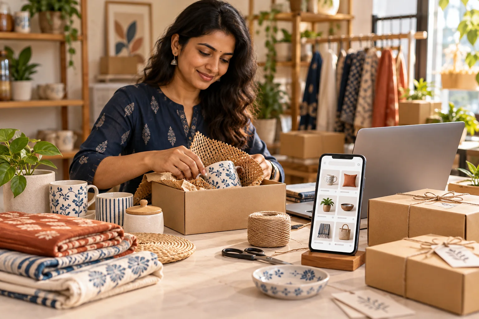
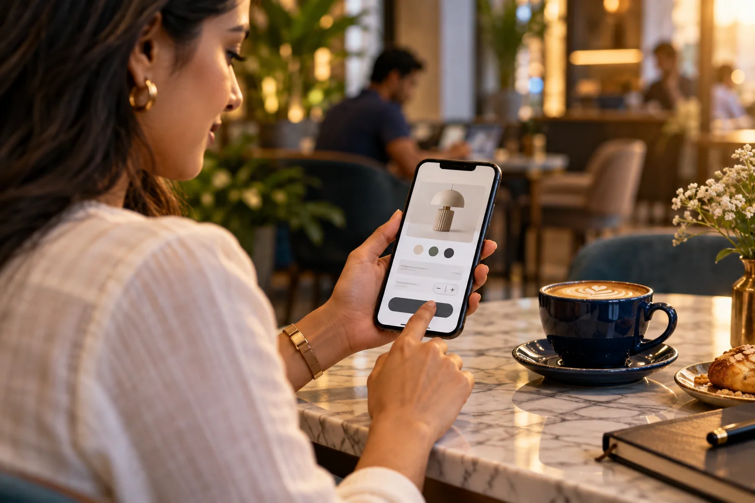
For many shoppers, the phone is the storefront. A mobile eCommerce website should make it easy to understand a product, compare useful details and complete an order without pinching, hunting or second-guessing. Good mobile commerce is not a smaller desktop page; it is a carefully prioritised buying journey.
Make product discovery feel effortless
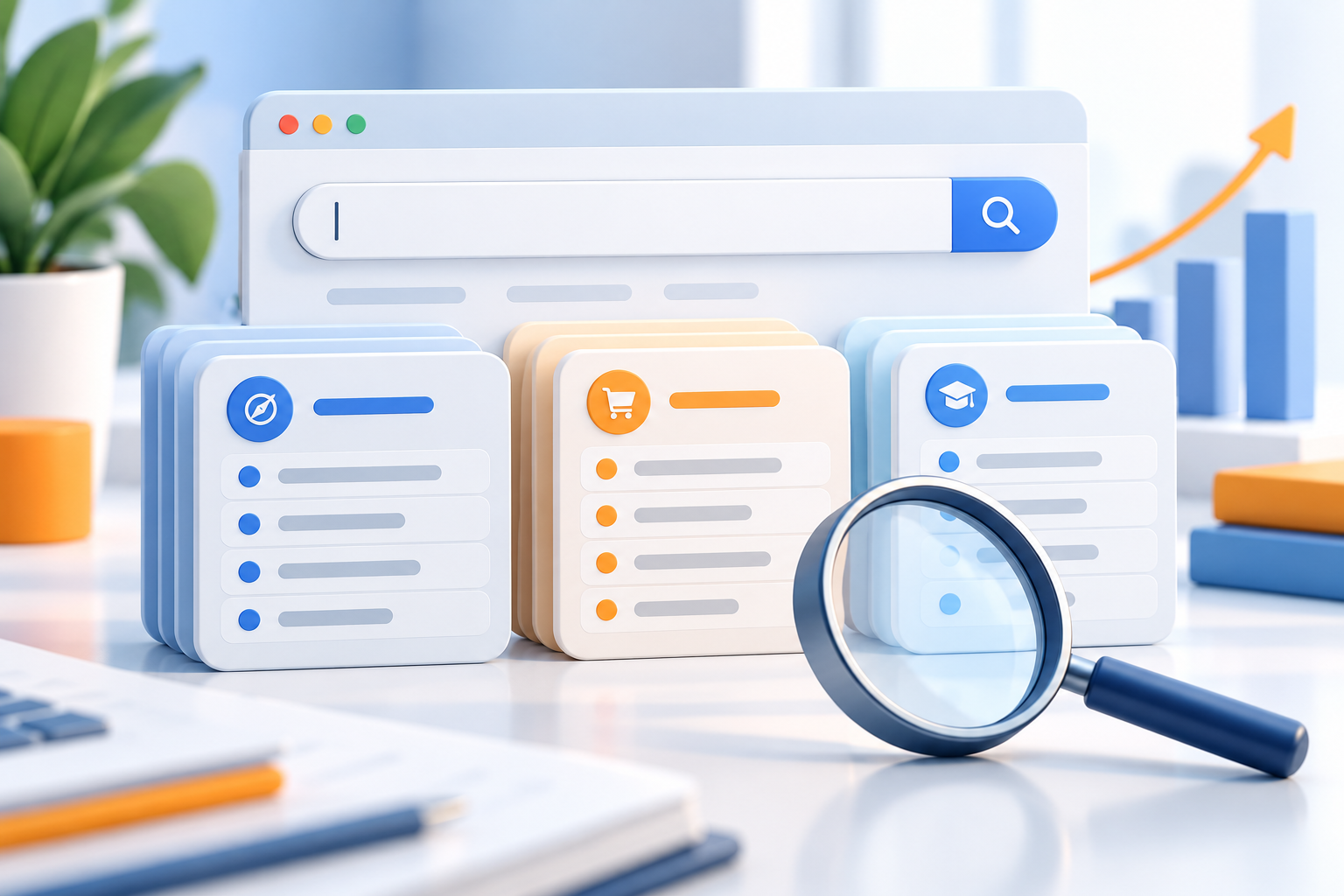
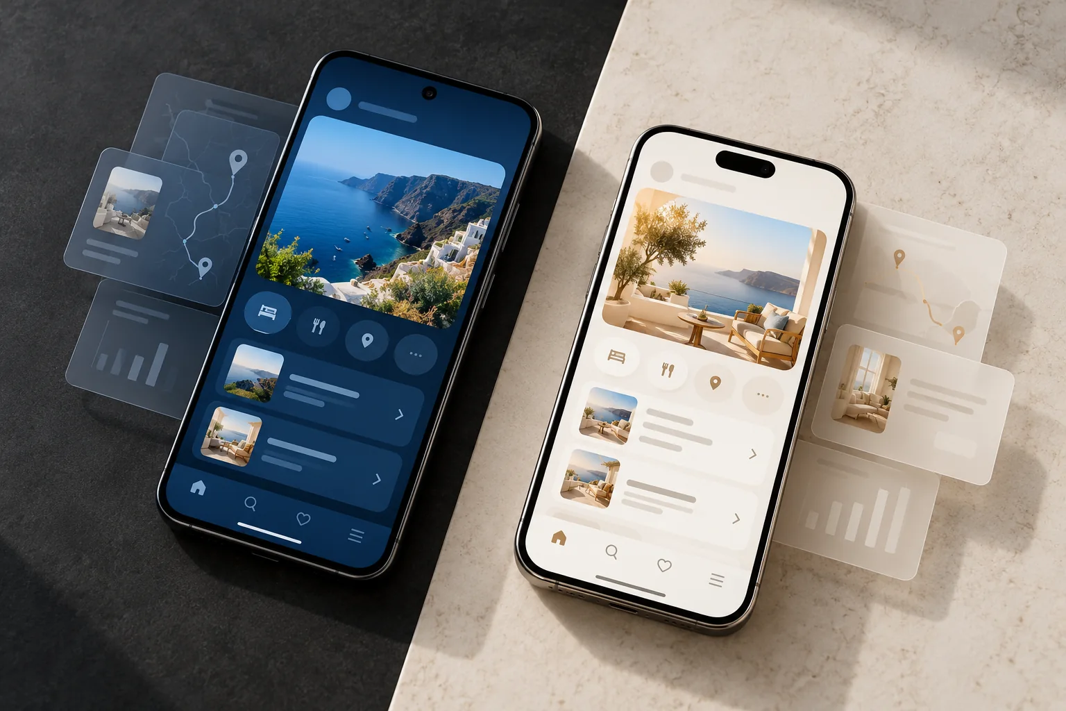
Start with clear categories, useful search and filters that match the way customers think. Product cards should show a recognisable image, name, price and a meaningful availability or variant cue. Avoid asking shoppers to open multiple pages just to learn the basics.
On a product detail page, put the strongest image and essential information first. Show size, material, delivery expectations and return guidance close to the decision point. This helps a visitor evaluate the product with confidence rather than searching through generic copy.
- Use consistent product photography and image crops
- Write specific names and descriptions
- Make variants and stock status easy to understand

Reduce friction from cart to confirmation
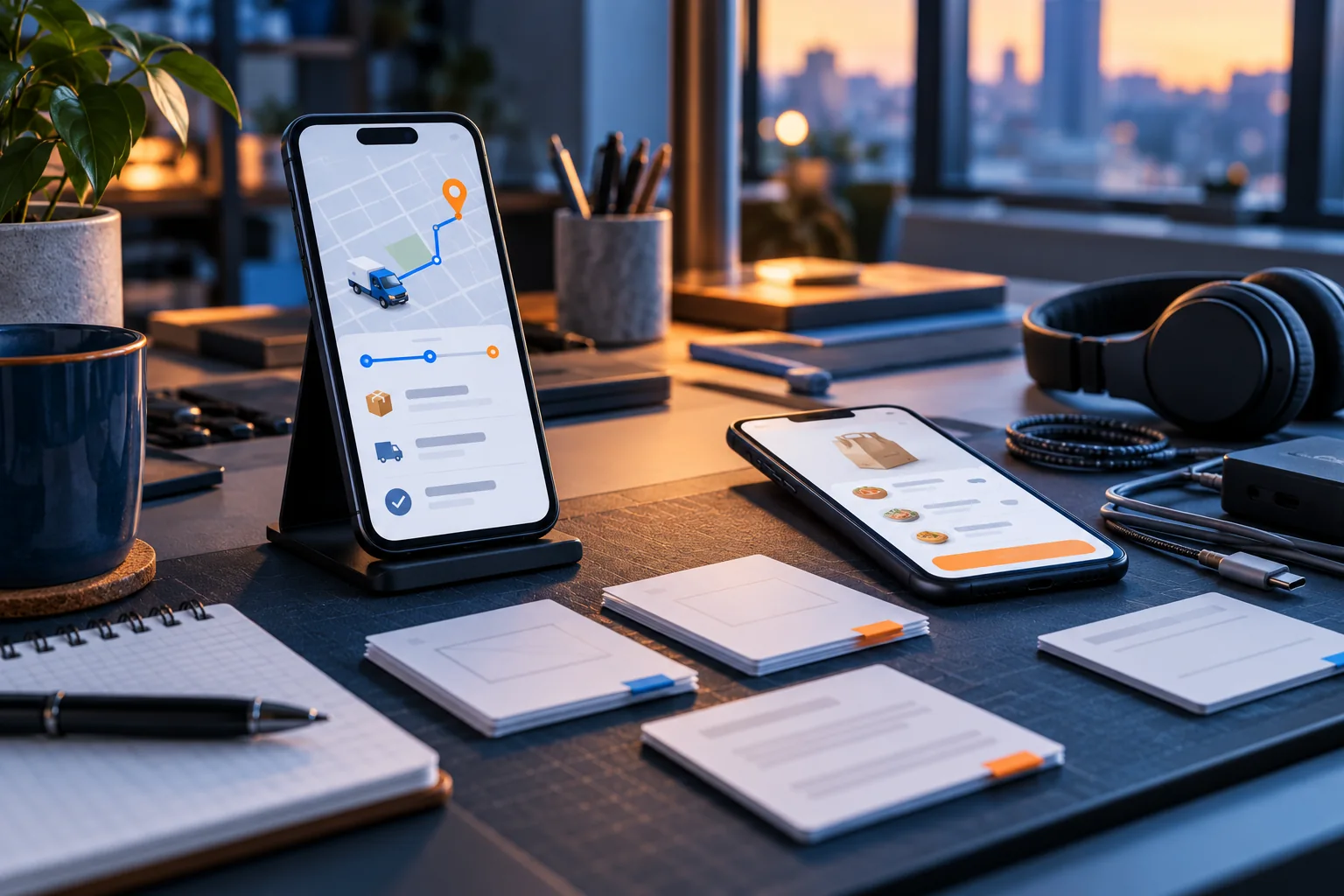
A clear cart should summarise what is being purchased and what it costs. Keep shipping charges, taxes and delivery timing visible before the final payment step where possible. Long forms, surprise fees and confusing error messages can interrupt an otherwise strong shopping experience.
Offer payment methods that suit the audience and explain what happens after an order is placed. A useful confirmation screen and follow-up message reassure customers that the transaction has been received. Checkout design should be tested with real product data and common mobile keyboards.
- Keep checkout steps focused and predictable
- Explain delivery, payment and returns clearly
- Provide visible feedback when a form needs attention
Test with real people and real devices
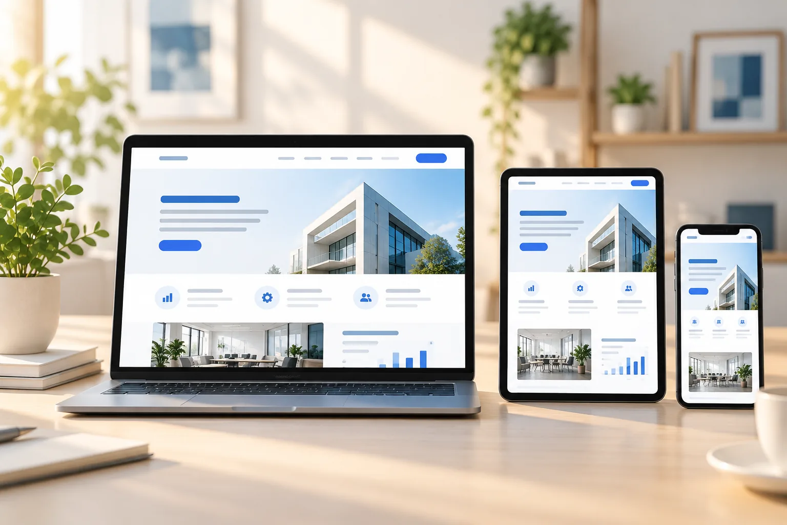
Review key journeys on different screen sizes, not only in a desktop preview. Check menus, image zoom, variant selection, cart updates and payment hand-offs. Small usability issues become especially noticeable when a customer is shopping one-handed or on a slower connection.
An eCommerce Website Developer in Patna can help translate these observations into a practical improvement plan. For a store serving Patna, Bihar or customers further away, keep the experience consistent while clearly explaining delivery coverage and customer support.
- Test product selection through completed checkout
- Check loading speed and touch target sizes
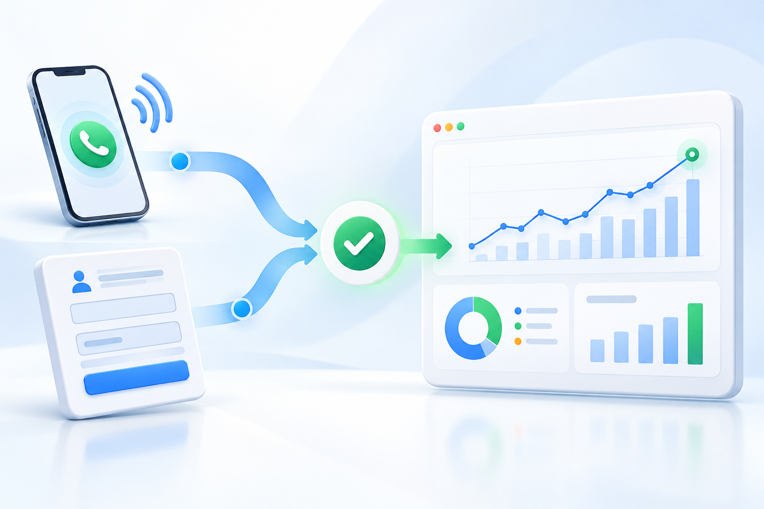
- Track where shoppers pause or leave the journey
A strong mobile store respects the shopper’s time. Make the product easy to assess, the total easy to understand and the next step obvious. Then keep improving from real customer questions and behaviour rather than adding features for their own sake.