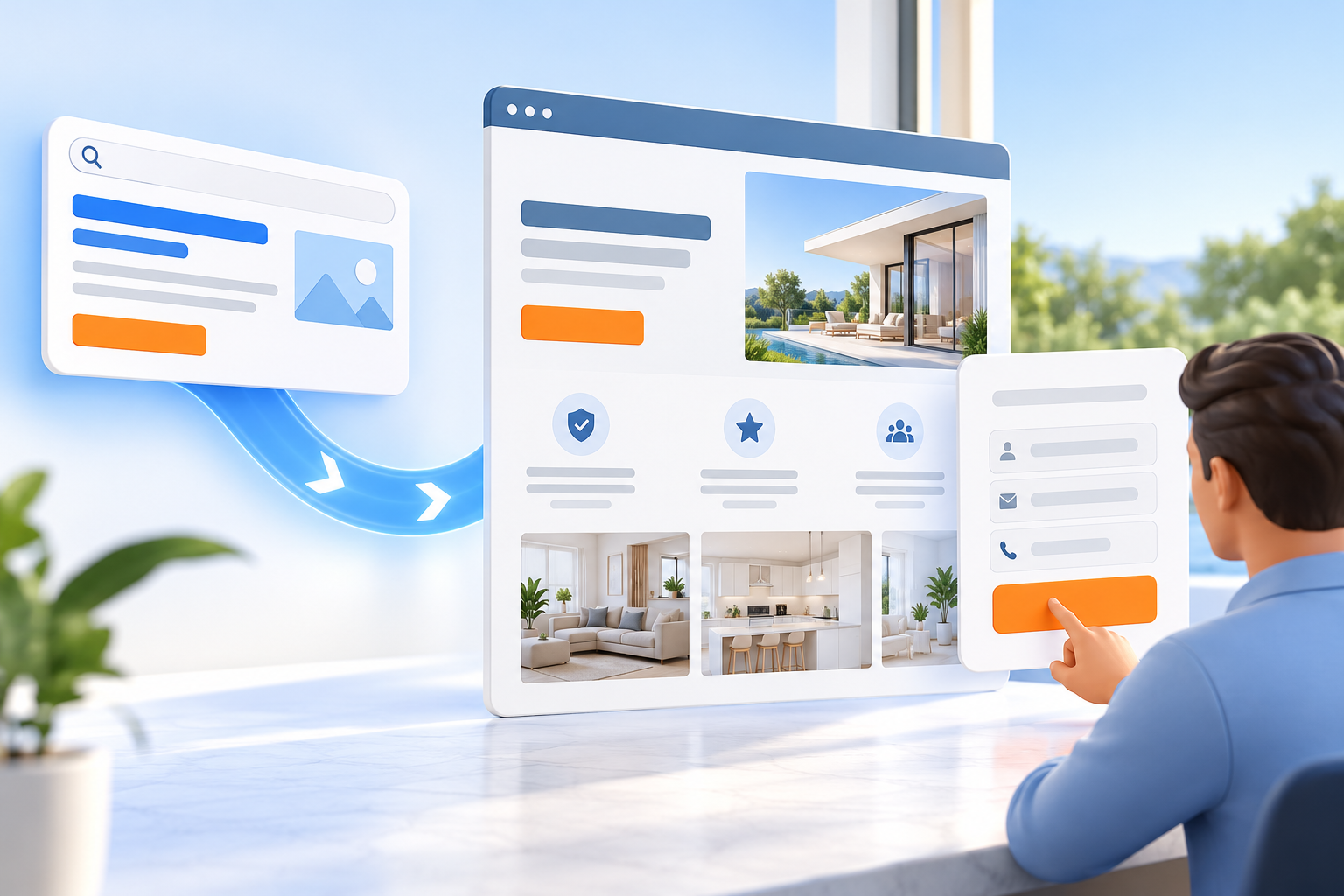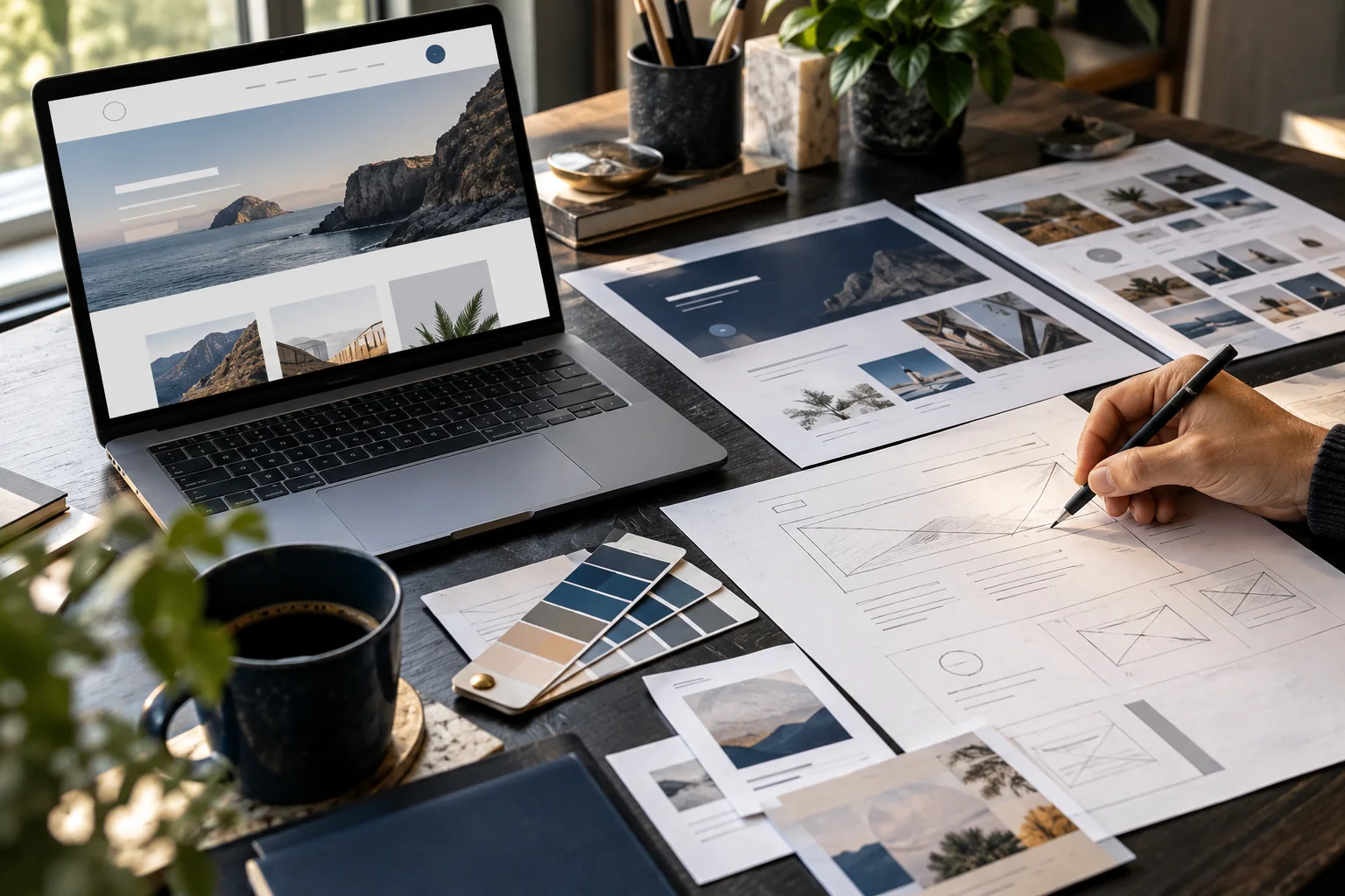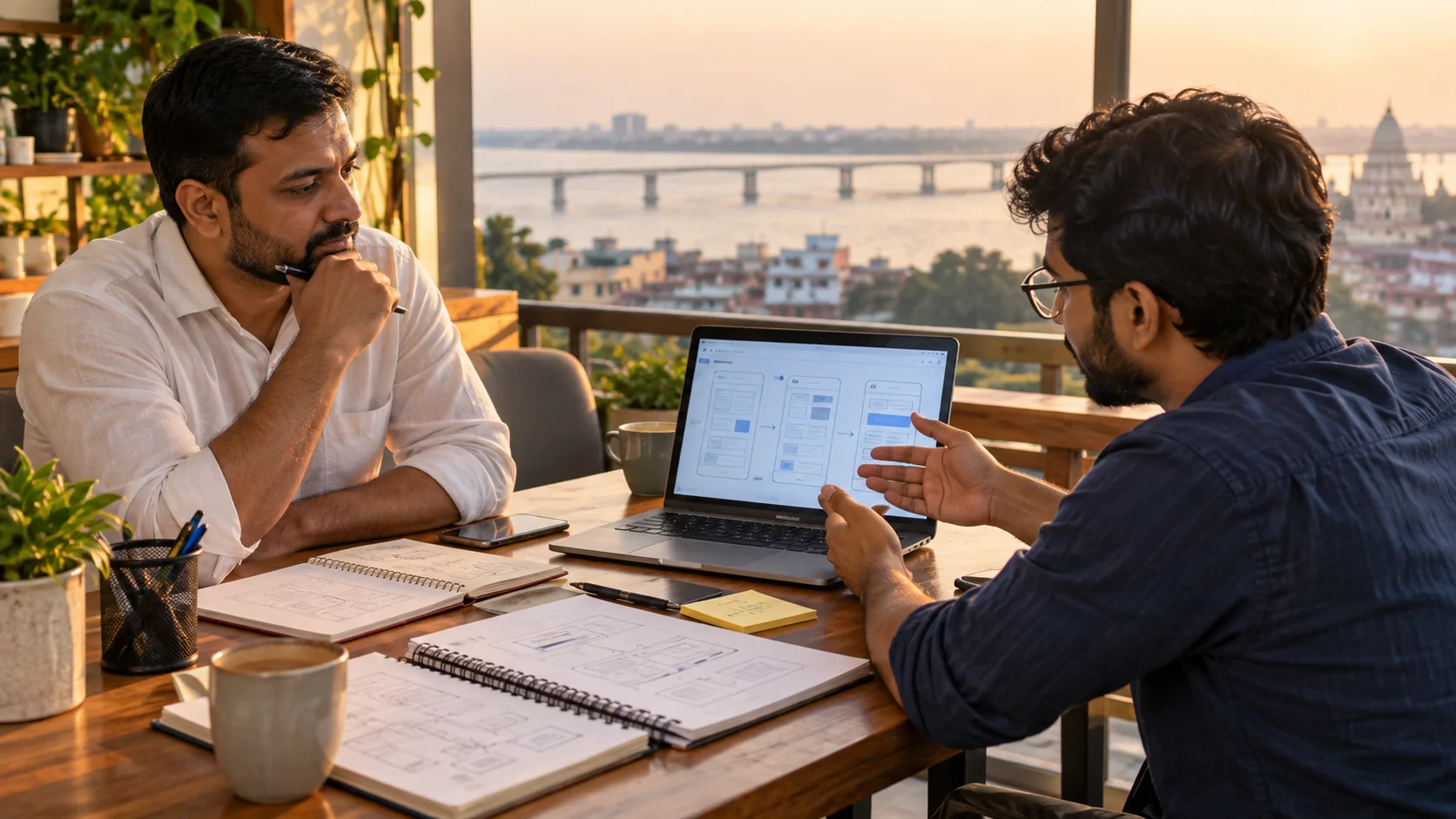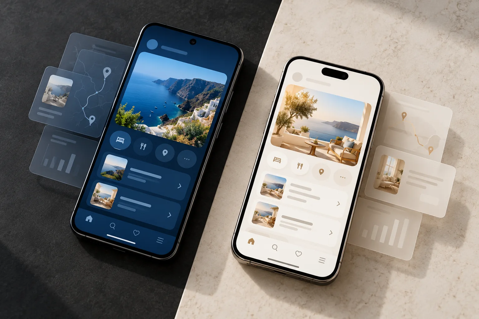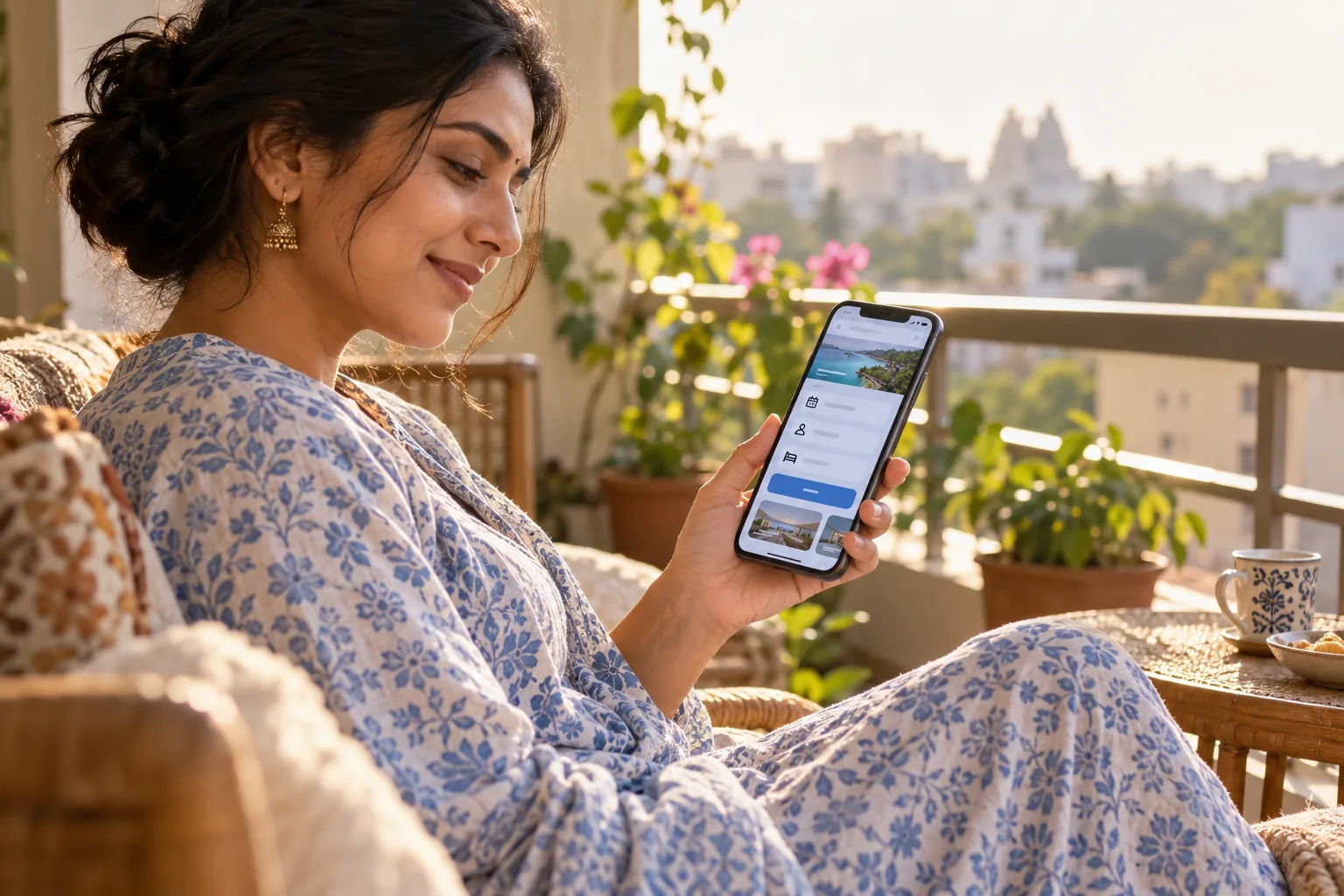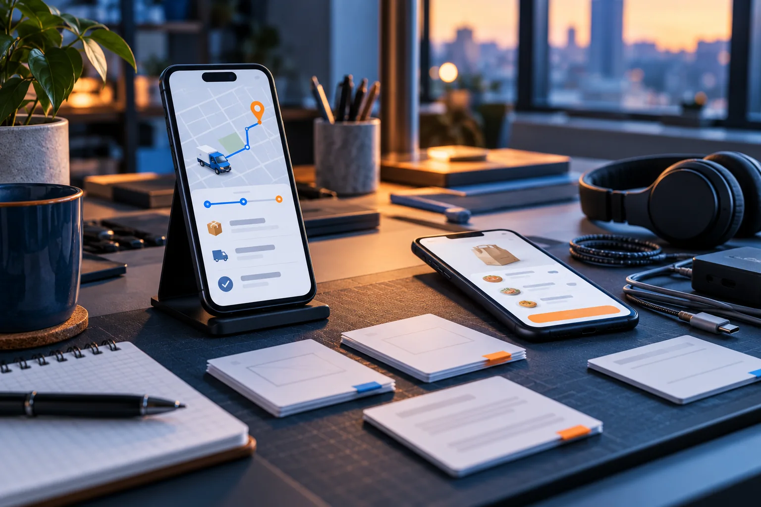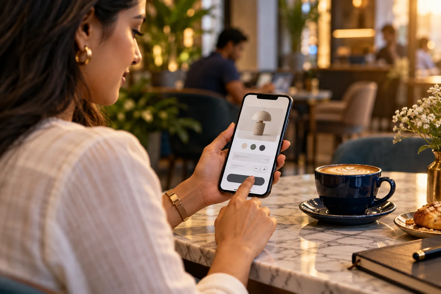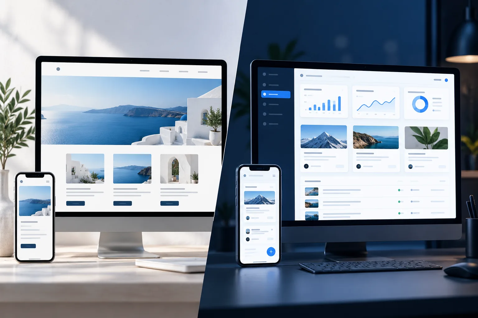
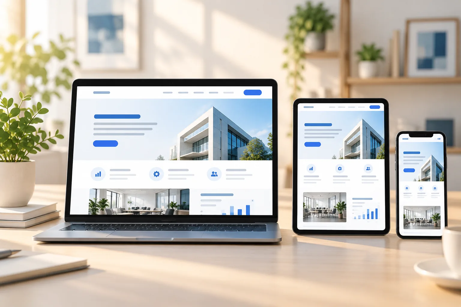
People may first discover a Patna business on a phone, then return to the website from a laptop before they enquire. Responsive website design keeps that experience coherent: the same brand, useful information and clear next step adapt to the screen in front of the customer.
Start with the smallest screen
A mobile-first layout helps a designer decide what matters most. Put the main message, essential details and contact action where they are easy to find, then expand the layout for larger screens. This is particularly useful when customers are browsing between errands or checking details while travelling around Patna.
Responsive design is more than shrinking a desktop page. Content order, image crops, button sizes and navigation need to be considered at each screen width. A focused mobile layout avoids tiny text, crowded menus and side-to-side scrolling.
- Readable type and comfortable line lengths
- Touch-friendly buttons with clear labels
- Navigation that remains easy to understand
Keep the experience consistent
A customer should recognise your business from one device to another. Consistent colours, typography, photography and page language build familiarity, while flexible grids let those elements rearrange naturally. Product, location and contact details should stay legible rather than being hidden just to preserve a desktop composition.
Test real page content at common phone, tablet and desktop widths. Check long headings, forms, image crops and menus—not just an empty template. This catches awkward wrapping and overlapping elements before customers encounter them.
- Flexible grids instead of fixed-width blocks
- Images sized and cropped for their context
- Forms tested with mobile keyboards and touch
Make mobile performance part of design
Heavy imagery and unnecessary effects can make a beautiful mobile website frustrating to use. Plan the visual design around appropriately sized WebP images, restrained animation and a clear page hierarchy. Fast, stable pages help visitors stay focused on the information they came to find.
For a Patna business, a useful responsive website makes it easy to understand what you offer and how to contact you, whether a visitor is nearby or viewing from elsewhere in Bihar. Good responsive design supports those practical tasks without making the interface feel cramped.
- Optimised images with descriptive alt text
- Stable layouts that do not jump while loading
- A prominent, accessible way to get in touch
Before approving a website design, review it on a phone in addition to a desktop. If the important details remain clear, the pages feel consistent and contacting the business is effortless, the responsive design is doing its job.